


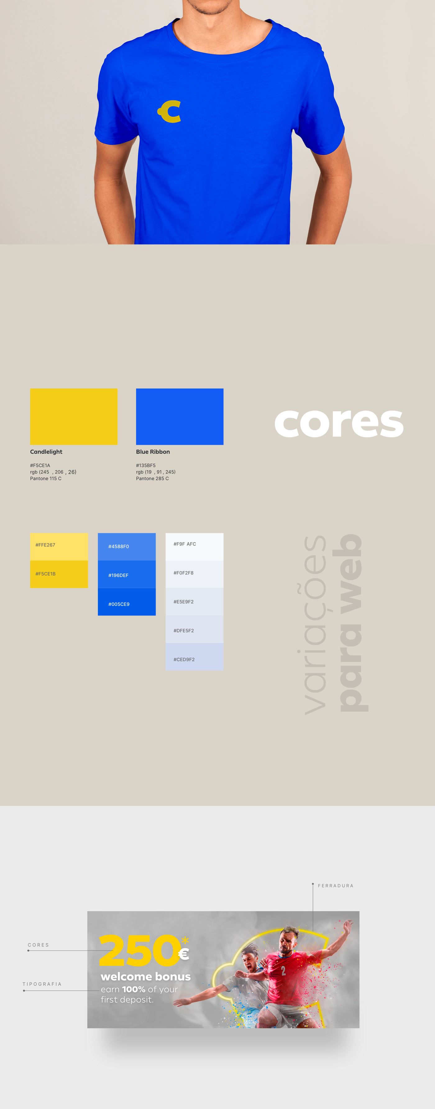
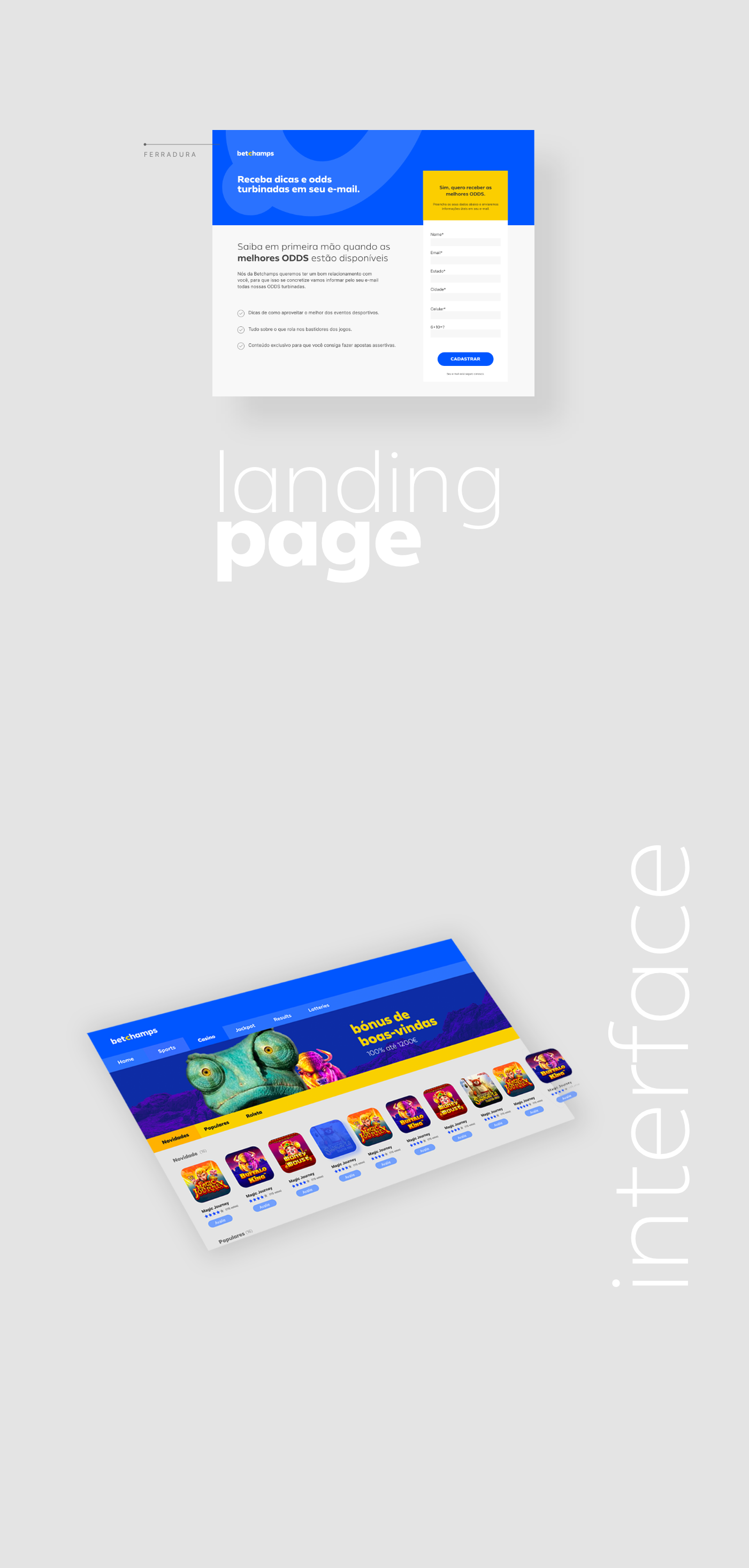
Por se tratar de uma marca com atuação exclusivamente para web, o primeiro passo deste projeto foi selecionar cuidadosamente a tipografia, pois a legibilidade foi prioritária, assim sendo possível conversões de mídias de uma forma assertiva.
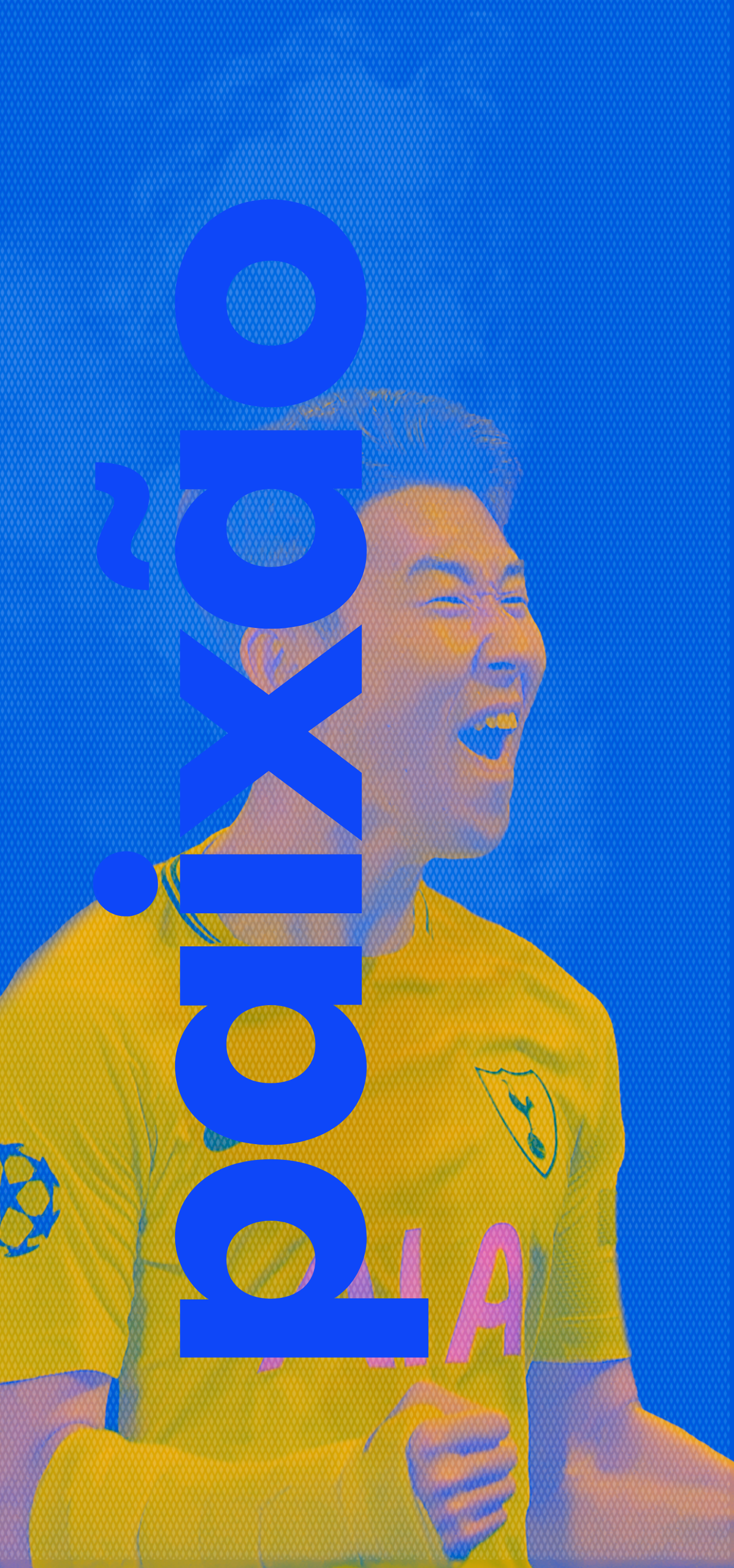
Algumas regiões ainda se discutem sobre a “segurança” e “privacidade” das apostas online, então foi escolhido a cor azul que justamente, segundo a heráldica, oferece essa sensação - de segurança. Para complementar o projeto das cores, eu escolhi o amarelo, que conforme círculo cromático, são cores complementares que causam destaque quando utilizadas juntas. E destaque é uma necessidade desta marca que está buscando visibilidade no mercado de gambling.
E por último, não menos importante, houve integração da tipografia com um símbolo: a ferradura. Que segundo o coletivo imaginário de muitos lugares está associado à sorte.
The Betchamps brand was created exclusively for the Web, and the first step of this project was to carefully choose the typography, once the readability is a priority so the media conversions could be made more assertively.
Some regions still argue about the “security” and “privacy” of online gambling, so the blue color was chosen, which in accordance with heraldry, offers the feeling of security. And to complement the color design, I chose yellow, once it is the complementary color of blue in the color circle, and when used together cause highlight.
And the highlight is a necessity of this brand that is seeking visibility in the gambling market.
Another important benefit is the integration of typography with a symbol: the horseshoe. Which according to the imaginary collective of many places is associated with luck.

Obrigado=)